
In the past few years, Microsoft has improvised its Office Suite with hundreds of new features. Whether you are working on Microsoft Word Document, PowerPoint, or Excel, you will be able to get your hands on valuable features that offer amazing presentations at work. Released in 2013, Microsoft Excel Quick Analysis Tool is now used in 80% of organizations in the world. With such high-end statistics, it is crucial to learn how to use excel’s quick analysis tool as it can help you land new job opportunities.
To begin with, excel quick analysis tool adds value to your Microsoft skills. One of the major uses of this tool is to quickly create charts based on the numbers in excel. For example, if you want to get a quick chart-based representation of a table in excel, you can simply click on the “analysis” option. It then serves you with multiple alternatives such as formatting, data bars, icon set, top 10%, and so on.
In finance and accounting, many companies portray their budget using excel quick analysis tool as it provides a quick view of what activity leads to how much expenditure? As a result, they can easily figure out potential surplus or deficit based on the chart alone.
Are you also looking to learn more about the excel quick analysis tool, but who has the time for premium excel training? If yes, don’t worry! The following guide on Microsoft features will help you learn how to use excel quick analysis tool. Let’s get started:
Table of Contents
What is the Excel Quick Analysis tool?
As the term “quick analysis” suggests, the Excel Quick Analysis tool is a feature in Microsoft Excel Spreadsheet using which users can quickly analyze numbers in different formats. For example, you can create a pie-chart of tables in excel. Henceforth, you can easily view which part of the table has the largest value and which has the lowest.
Similarly, it also helps you create a bar chart out of a personalized table in an excel spreadsheet. Akin to this, Excel has other features like Color highlight, which changes the color of cells based on a conditional method.
In simple words, the quick analysis tool in Microsoft Excel is for analyzing numbers in a conditional mechanism in order to grasp information quickly and more effectively.
According to our true and tried research on this tool, there are five major sub-features added to this tool. In this reading, you will learn about each feature and how to use it. Let’s begin.
What are the different features of the Excel Quick Analysis tool? How to use it?
When you select a table on Microsoft Excel Spreadsheet, you will observe that a small clipboard icon appears on the right bottom corner of the selected table. This is a direct icon for excel’s quick analysis feature. As you click on this icon, five major sub-features will appear. These are:
- Formatting – This feature allows you to create and portray your data in a new format. For example, currently, your data is in the form of a simple excel spreadsheet table. But, by conditional formatting, you can show data in the form of data bars or icon sets, or different colors.
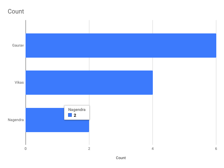
- Charts – Do you remember creating charts in mathematics based on the data available? This feature allows you to convert your data table into a chart form. You can create pie charts, line charts, data bar charts, conical charts, and many others. It is all about the presentation of data.
- Totals – As the term “totals” suggests, this feature of excel quick analysis is quick to add all the numbers in rows and columns for effective calculation. It is a helpful feature for companies that deal in numbers, budget, and so on.
- Tables – In the event that you have randomly put numbers and heading in an excel spreadsheet without formatting it. The tables feature can help you convert data into an accurate table form.
- Sparklines – Sparklines feature is a substitute for the Charts feature as it allows you to set up sparklines in front of each row to determine and compare numbers by setting up small lines, columns, bars, etc.
How to use it?
As mentioned above, there are five major sub-features in excel quick analysis tool. Each feature serves different purposes. So, let’s focus on how to use each feature one by one!
How to use formatting or conditional formatting in excel quick analysis tool?
For the most part, conditional formatting alters the way that table in the spreadsheet appears. How to use it? Follow the instructions given below:
- First of all, select the table in the spreadsheet which you want to format conditionally.
- Please note that conditional formatting stands for the formatting of data based on condition. For example, if the score in a cell is less than 50, show the “XYZ” icon in such a cell. This is an example of a condition you can set.
- Once you have selected the table, an excel quick analysis tool icon will appear in the corner. Click on this icon. If you cannot locate this icon, you may have this option disabled. Please scroll down to view the solution for “why excel quick analysis tool not showing?”
- When you click on it, please further click on the “Formatting” alternative.
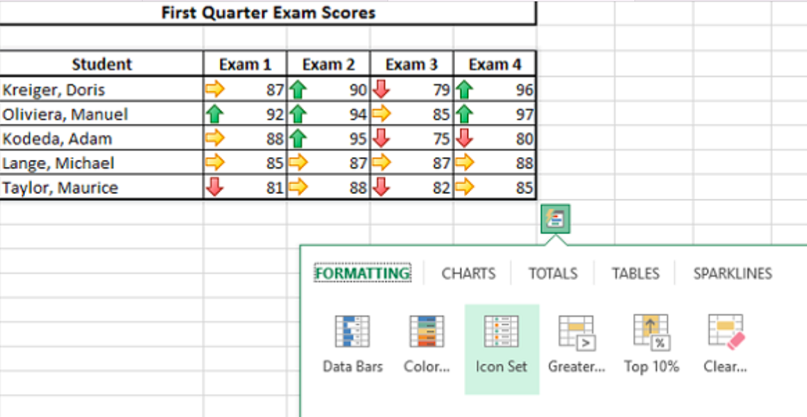
- Now, click on the “Data bar” to format the table based on bars. In this, small bars will appear on the cells with numbers.
- Another option is “colors” in formatting, which allows you to set up a portrayal of the table in different colors.
- Similarly, to use icon sets (such as arrows), click on the icon set under formatting.
- Once formatted, please save the sheet.
Note: To delete formatting, you can click on the “undo” button or use the “CTRL + Z” shortcut key.
How to make charts in Excel using the quick analysis tool?
Charts are another useful and effective feature when you want to present data in an easy format to comprehend information. To create a chart in an excel spreadsheet, check out the following instructions, which utilizes a quick analysis tool:
- First of all, select the table in the spreadsheet which you want to convert into the chart.
- Please note that charts convert data into a drawing form, but it does not delete the original table.
- Once you have selected the table, an excel quick analysis tool icon will appear in the corner. Click on this icon. If you cannot locate this icon, you may have this option disabled. Please scroll down to view the solution for “why excel quick analysis tool not showing?”
- When you click on it, please further click on the “Charts” tab.
- You will see different types of chart options below.
- To convert the data table into Cluster bars, click on the same.
- Similarly, you can choose to present data in the form of a Pie chart.
- Once the chart is created, please save the sheet.
Note: To delete chart representation, please select the chatbox and click on the backspace button on the keyboard.
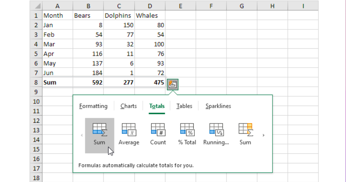
What are totals in excel? How to use it?
In the Excel Quick Analysis tool, the “Totals” feature is used to calculate the sum of entire data, create the average sum of the entire data, count rows, and columns, create %total data, and run the numbers.
Each of these functions helps in the calculation of data for accounting and financing purposes. For example, running the sum of numbers allows the user to figure out growth in numbers as the table expands. Here is how to use totals in excel:
- First of all, select the table in the spreadsheet which you want to calculate in the context of totals.
- Please note that totals will not change tables in any form. It will only show the total sum of numbers, count, running, etc.
- Once you have selected the table, an excel quick analysis tool icon will appear in the corner. Click on this icon. If you cannot locate this icon, you may have this option disabled. Please scroll down to view the solution for “why excel quick analysis tool not showing?”
- When you click on it, please further click on the “Totals” tab.
- You will see different types of calculator options below.
- To create SUM of all the numbers in a column, click on the SUM option.
- Similarly, click on average to calculate the average sum.
You can save the data by clicking on the file option above. Or use CTRL + S to do so.
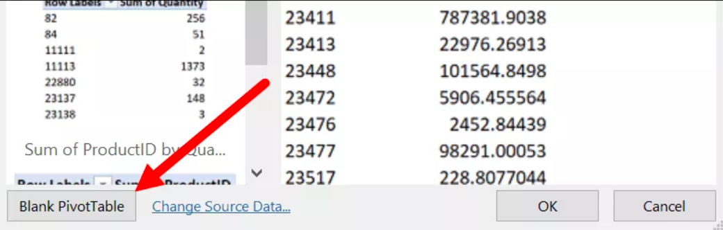
What is “Tables” in excel? How to create it?
In the event that you want to represent data on a spreadsheet excel in a proper table, you can easily select the data. Then, go to the “Tables” option on the Excel Analysis tool. Select any type of table format that you see fit. Creating tables in Excel is much easier than in any other Microsoft Office Suite.
Here is how to do it:
- First of all, select the data in the spreadsheet which you want to convert into a table.
- Once you have selected the database, an excel quick analysis tool icon will appear in the corner. Click on this icon. If you cannot locate this icon, you may have this option disabled. Please scroll down to view the solution for “why excel quick analysis tool not showing?”
- When you click on it, please further click on the “Tables” tab.
- You will see different types of table options below.
- To create a simple table of the database, click on the first table.
- Similarly, you can choose any table from the list.
Note: Sparklines in the Excel Quick Analysis tool are also easily accessible and used to depict a database through small graphical lines, columns, and so on.
Excel Quick Analysis tool not showing up? How to enable it?
Please note that if you are using an outdated version of Microsoft Excel, a quick analysis tool will not appear like one. Instead, please upgrade Microsoft Office on your Windows PC. In the event that the Excel Quick Analysis tool is still not showing up on your PC, it may mean that you have disabled it. Please follow-up steps given below to enable it:
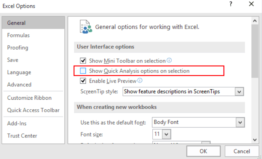
- Navigate to the “File” alternative given in the main toolbar.
- Select the “General” tab in the main file menu.
- On the right-hand side, observe the “show quick analysis” option.
- Ahead of this option, please tick the square to enable it.
- Save the settings and go back.
Note: Please try to access analysis tool by using CTRL + Q shortcut key if the above-mentioned guide does not work out.
Epilogue
Have you learned an Excel quick tool for analyzing numbers? Now, you can add advanced excel to your list of Microsoft skills. For more Microsoft tips and tricks, bookmark us and get a quick notification for new updates every day. Thank you for learning with us. Good luck!


